
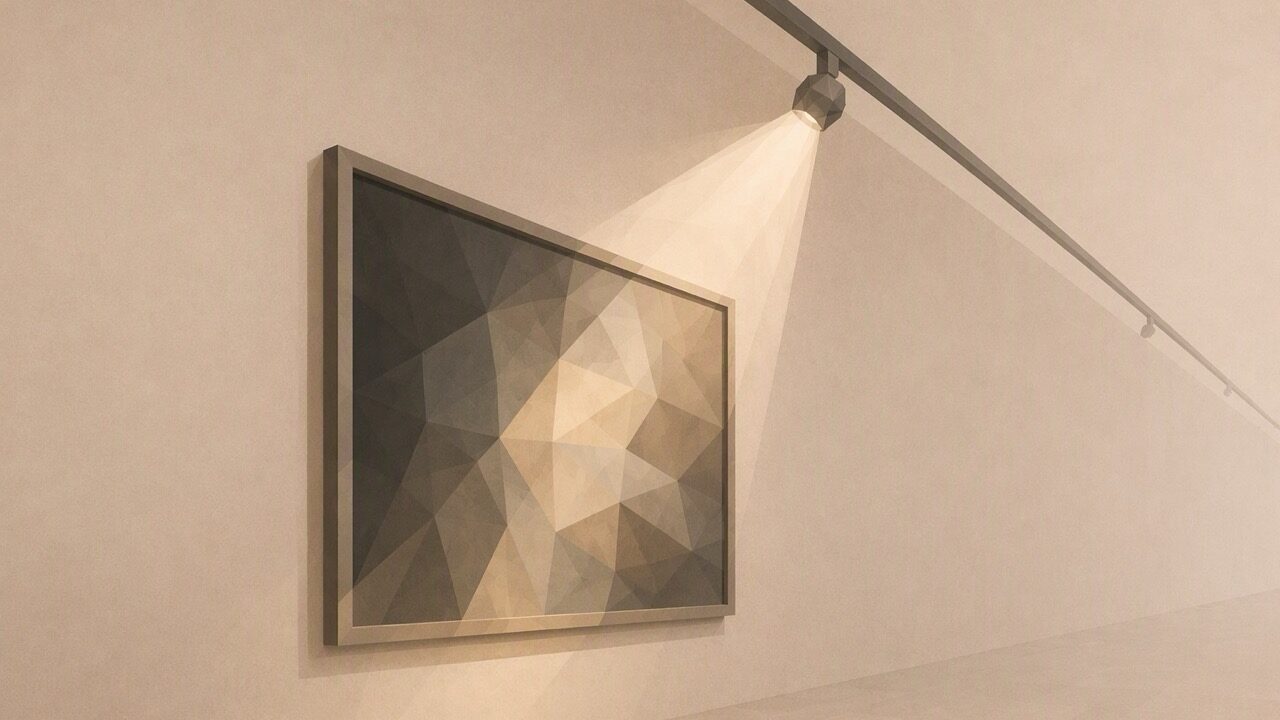
There is a decision made regarding every painting you have viewed in a museum that is never communicated to you: with how much light, and of what kind, you are permitted to view it. This is neither a minor decision nor a technical one in the innocuous sense of the word. It determines which colours reach you, which tonal relationships you perceive, whether a glaze is legible or disappears, and whether a shadow possesses depth or closes into black. The painting you observe is, in part, a product of that decision. And it is taken in advance, for reasons that almost never pertain to the painting itself.
The primary reason is that light destroys. Not metaphorically: radiation decomposes pigments, discolours inks, and degrades fibres, doing so in a cumulative and irreversible manner. No restoration is possible; a watercolour that has lost its red never recovers it. Hence, museum conservation operates within limits, and those limits derive from a rule consolidated half a century ago: 50 lux for highly sensitive items—works on paper, watercolours, photographs, textiles—and 150 for oil or acrylic paintings. 50 lux is minimal. It is, more or less, the dimness of a cinema auditorium before the film commences. If you have ever entered a drawing gallery and required a minute to discern anything, it was not a personal failing: it was the price required for those drawings to continue existing two hundred years hence.
The point of interest is how that limit is administered, for it functions not as a ceiling but as a budget. What causes damage is not the intensity of the light, but the dosage: intensity multiplied by time. 50 lux for 24 hours inflicts precisely the same damage as 200 lux for six. 200 lux for 200 hours is equivalent to 50 lux for 800. A museum, therefore, does not merely decide how illuminated a work is: it decides how much visible life remains for that work and how it is expended. To exhibit is to consume. Each exhibition is paid for with a fraction of the piece's future, which is why works on paper are rotated, withdrawn, and left to rest for years in darkness. The gallery is not the natural habitat for such works. It is a timed exception.
The division between fragile paper and resilient oil does not always hold: there are oil paintings with red lacquers that vanish with minimal exposure, and charcoal drawings that endure without faltering. Current practice tends to evaluate the genuine sensitivity of each work rather than applying a standard table. Yet the table remains, and it continues to decide by default.
The other decision, which almost no one associates with conservation: not how much light, but what kind of light. And here, two factors govern what you perceive. One measures the fidelity with which a source reproduces colours; conservators recommend not falling below 85/100, and many museums mandate over 90, because with a low index, reds are muted, skin tones become muddied, and the relationships calculated by the painter cease to exist. The other measures whether the light is warm or cool. And there is no correct answer here: studies demonstrate that, at the low intensities of a museum, the public prefers a warm light, around 3500 or 4100 Kelvin. They prefer. That is to say, taste enters into the selection, as does the taste of an era.
The transition to LED, which has reorganised the lighting of major museums in a mere fifteen years, rendered that choice explicit. The National Gallery in London announced the change across the entire institution in 2011, and one of its technical reasons is revealing: LED can be dimmed without altering the colour of the light, a feat tungsten did not permit—as an incandescent bulb is dimmed, the light becomes more amber. The Rijksmuseum reopened in 2013 with 9,500 square metres of gallery space illuminated by LED, with each work adjusted individually. And at the Louvre, a 34-diode lamp was designed for the Mona Lisa with a very specific objective: to compensate for the colour alteration introduced by the bulletproof glass protecting it. It was necessary to design a specific light to counteract the effect of the display case and restore the painting to an appearance deemed correct.
That verb, to return, is what falters. Correct with respect to what? In 2014, the National Gallery mounted a public experiment in which one could view the same painting under different light conditions, including a simulation of candlelight, and ask visitors which they preferred. One of their conservation scientists posed it with precision: old paintings were created to be viewed by the light of a candle or a window, and modern ones under tungsten or fluorescent light. There is no neutral illumination that reveals the work as it truly is. There are illuminations that approximate it to different moments in its history, and to choose one is to choose which.
As a painter, I know this in a way that does not derive from academic study. A painting is created under a specific light, and that light informs every decision: one adjusts a value, raises a tone, kills a highlight, and that entire calculation is performed against the light present while painting. Later, the work departs and is exhibited under another. This is neither a betrayal nor an accident; it is the norm, and it is impossible for it to be otherwise. Yet it signifies that no painting is ever viewed exactly under the conditions in which it was resolved.
We tend to imagine the museum as a transparent space, a neutral box where works simply exist and we simply observe them. It is not. Between the painting and your eye lies a chain of decisions—how many lux, for how many hours, with what colour fidelity, at what temperature—made by conservators who perform their duties well and who are, moreover, obliged to make them. There is no option to abstain from deciding: even switching off the lights is a decision regarding the work. What we perceive is not the painting; it is the painting under conditions fixed by someone considering both our eyes and the next two hundred years. Knowing this spoils nothing. It merely alters slightly what one believes one is observing.
On the open conversation
This text intersects with a line of inquiry I have been pursuing: that of the unseen infrastructures which condition experience, and the false neutrality of exhibition conditions. Museum lighting is an exemplary case, for within it coincide a genuine obligation for conservation and an aesthetic decision that is rarely declared as such. Should anyone wish to intervene from the perspectives of preventive conservation, lighting design, museography, or the practice of painting, this notebook remains open.
Sources
Canadian Conservation Institute. Agent of Deterioration: Light, Ultraviolet and Infrared (Stefan Michalski). Traditional limits of 50, 150 and 300 lux and critique of their mechanical application.
Canadian Conservation Institute. CCI Notes 10/4 (lighting of paintings; CRI and colour temperature).
CIE 157:2004, Control of Damage to Museum Objects by Optical Radiation.
American Museum of Natural History and Conservation Center for Art & Historic Artifacts (CCAHA). Guides on light exposure and calculation of cumulative exposure in lux-hours.
National Gallery, London. Announcement of LED lighting installation, April 2011; public experiment from the Making Colour exhibition, 2014.
Rijksmuseum and Philips. LED lighting of the renovated museum, April 2013.
Toshiba and Musée du Louvre. LED renovation of the Mona Lisa gallery, June 2013.